Whatever aspect of the system we are viewing, we always want a ‘point in time’ view, but we also need to see trend data, to make sense of what we are seeing. In performance, you might see a spike in CPU resources in use, but that may only have meaning if you know that this isn’t a time-based, normal behavior. We can only do a good job if we understand the way things work at each hour, on each day, etc. At one time, it was common to collect detailed data and run reports when you wanted to understand the past, but no one has the time anymore. We need instant access to the information, and we need it presented in a way that helps us more quickly do our job. Trends matter.
When I started working as a developer, we had to provide estimates for new projects. To get a valid estimate, I had to scan the programs that I expected needed to be changed and try to document how these programs related to each other. Then I would try to understand how complex the programs were based on my experience and some quick looks at the source code. It always frustrated me that there was no standard way to estimate or plan projects that would allow me to consistently judge each program against the others so we could know where the difficult parts of the project would be. Sometimes the estimates were needed quickly and I was forced to just make a best guess based on what I know about the field that was being changed or the programs that were to be changed.
At other times, our director would ask about the quality of our application. We would answer by telling her our process and how we managed the source code. She always wanted a way to understand the quality of the code being written but it was hard to give a great answer since all we had was our own judgement about the work we were doing.
But what if you could have a picture of the complexity or your application and a trend chart so your manager would know if the complexity is going up or down? What if she had statistics so the number of components of each type was available at any moment? It turns out you can have all of this and more with CM evolveIT. In addition to these must-have features, each developer can quickly find the detailed metrics for each program with charts that compare complexity with the Difficulty metric (how difficult to understand the program) and Volume metric for each program.
In the new CM evolveIT Dashboard, you can see the kinds of metrics available with this now-available capability.
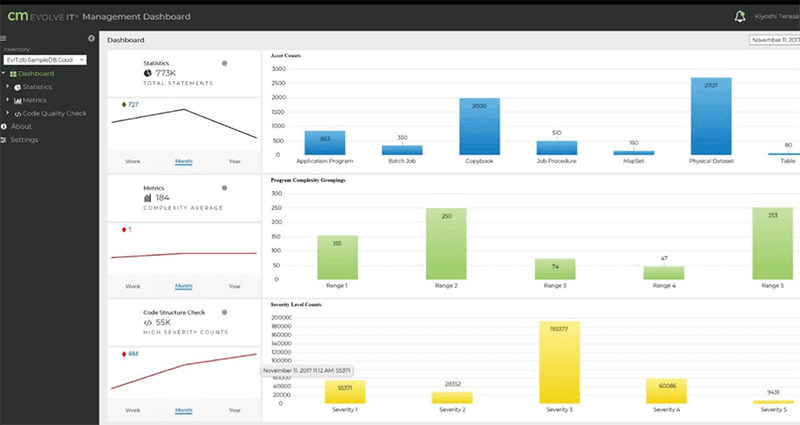
Fig. 1 – Front Page of CM evolveIT Management Dashboard giving an overview of the metrics.
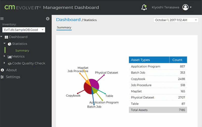
Fig. 2 – Inventory statistics showing a summary of the counts of components
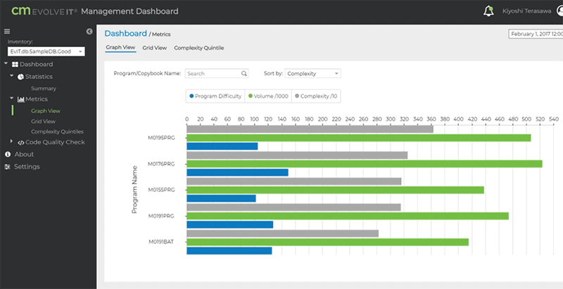
Fig. 3 – Inventory metrics – A graphic way to view the detailed data.
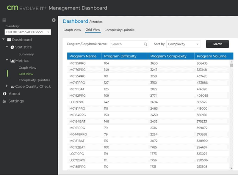
Fig. 4 – Metrics Grid View – A tabular view of detailed data.
But if you’ve never thought about this, you may wonder what to do with this data. This data can provide information that would help you find areas of code that could be improved and understand which is most important. By understanding this information better, you might be able to reduce costs, avoid hardware upgrades and increase the ROI.
Almost all software projects now are complex and we can get lost in the details. When you can quickly get to metrics, you can better make decisions about code quality, estimating costs, managing performance and more. It may also point to opportunities to improve the project while in the thick of it, instead of waiting until you’re in unit testing to see the programs more holistically. With Agile programming being the state of the art, you want easy ways to understand these metrics to achieve faster software iterations but with lower risk.
With later releases, you will see more information, such as code quality. Check it out! This might be the best step you take in your DevOps career in 2018.
by Roger Hammer
